Making Noted
12/30/2013
Noted is a simple gesture-driven note app we recently released for iOS. There were a lot of design decisions that were made along the way which led us to what we finally shipped. We thought we’d share a bit more about that process.
Believe it or not, work began on Noted almost two years ago on March 21, 2012. It was much more complex of an idea at the time and we thought putting together an initial prototype would be a great way to challenge a new member of the development team. Once we reviewed some early designs, he was definitely up for the challenge.
The inspiration for Noted came from glancing down at a stack of sticky notes and asking, “Can we make a note app that feels as effortless and approachable as this simple stack of paper?” We were all using note-taking apps on our iPhone, but there was something tired about seeing a list of notes, tapping on one, having the view slide over to view that note, tapping Back to return to the list of notes, etc. We wanted to try something different.
Gestures & Direct Manipulation
We thought a lot about what we had learned from making apps like Start; its gestures, sense of direct manipulation and the ability to move through content quickly. Those were the things we focused on, as well as some other grand ideas that never made it through.
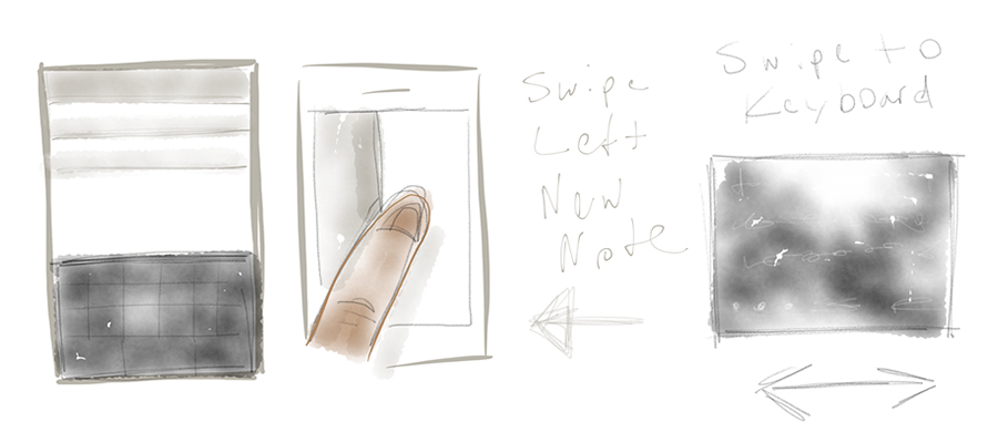
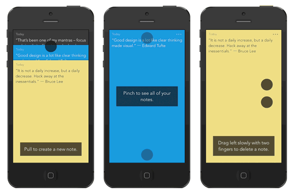
Gestures are often used as shortcuts to perform actions that are already available via an affordance or put in place for “power user” actions that may be be hidden and aren’t necessary to fully realize the capabilities of an interface. To put as much focus on the content of the note, we heavily utilized gestures and they’re core to using Noted.
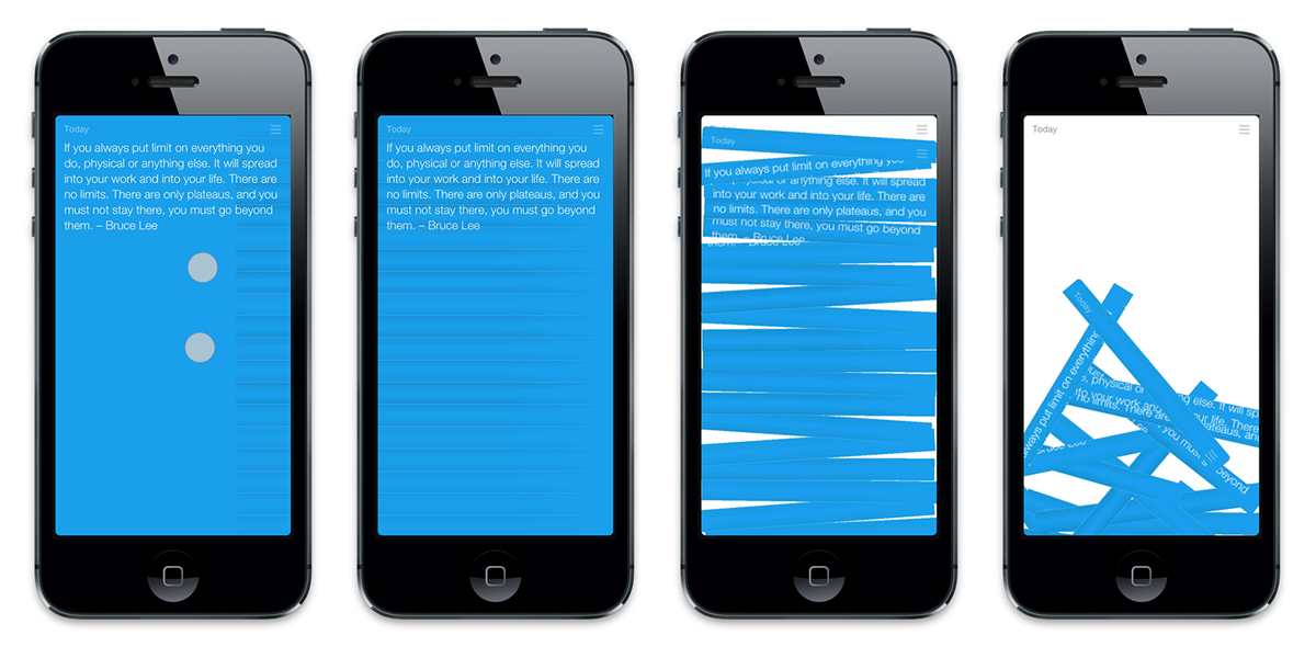
Rather than the back and forth between a master-detail navigation, we thought it would be nice to simply swipe through notes. Deleting a note could be as simple as a two-finger swipe, which would “shred” the note – very satisfying. In fact, shredding a note looked much like the shredding of a pass before Passbook was announced. Although, we ended up with a different approach.
Carrying that sense of direct manipulation forward, maybe you could pinch the note to bring all your notes into view, like a stack. Creating a new note could be done via pulling down on the interface to expose a new note that was ready to capture your thoughts.
Along the way, we tested our ideas with a stack of playing cards.
Coupling gestures with this sense of direct manipulation provided a pretty satisfying experience that we weren’t getting from other note-taking apps. It also made Noted feel fast.
A Custom Keyboard
Early on, there was an idea for creating a custom keyboard that would support gestures, supply a wider range of characters and have a more modern appearance than the keyboard in iOS 6 at the time. There were some ambitious ideas that didn’t make it into the version of Noted in the App Store today.
Gestures could be used for common commands, like swiping up on a character to capitalize it or swiping down anywhere on the keyboard for a line break. This keyboard had a visual appearance almost in-between a tactile set of keys and a smooth trackpad with some nice transparency to let the note color show through. The idea here was that you’d never have to break the flow of your typing to move your thumbs to tap these modifier keys, although we kept the Shift and Return keys there for comfort.
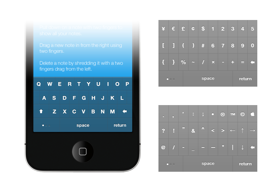
We also wanted to make it easier to access a wider range of special characters via the keyboard. This was done by adding the ability to swipe left and right between different keyboards. You could also tap a dot indicator in the bottom-left of the keyboard to cycle through keyboard and it would always show where you were in the lineup.
These were all interesting ideas that we were able to prototype and it was great seeing them come to life. We even created a process that made it easy for anyone to create custom keyboards. In the end though, the keyboard didn’t feel core to what we were trying to do, so we killed it.
The Walkthrough
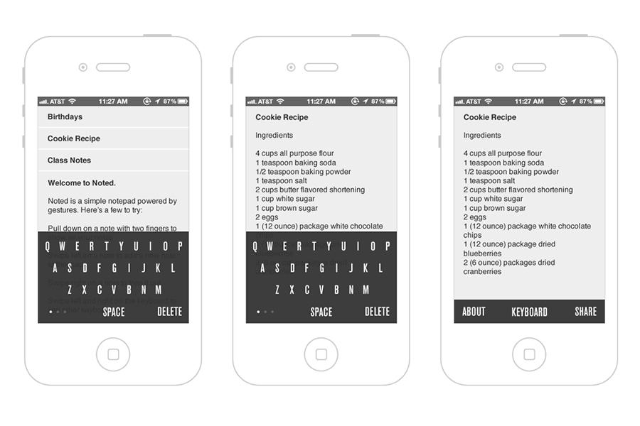
It’s pretty common to see heavily gesture-driven apps use coach marks or overlays as a guide on how to use an interface. Most people may just skip them and get lost or forget what they’re supposed to do. We wanted to train people how to use Noted by having them perform the interactions they would need to know in order to use the app. This meant creating a script for the user to follow within the context of some notes we give them to play with.
We ask the user if they’d like to do the walkthrough right when they open the app. If they choose not to, we still give them some notes to play with and a way to replay the walkthrough if they want to.
Hello iOS 7
A lot of the hard work of figuring out what Noted should be was done in iOS 6. And then at WWDC 2013, iOS 7 was announced. We weren’t sure what this meant for Noted. On the one hand, we were excited about what iOS 7 could bring to Noted and on the other, we weren’t sure what we were going to have to rework. There was already so much time put into the app and this meant more hours would need to be invested. But, we wanted to get Noted right.
Besides some of the underlying aspects of Noted being reworked for iOS 7, we also leveraged physics and other interface dynamics that come along with the update. The stack of notes shift as you tilt your phone, notes spring forth for editing and overall, the app feels more lively. There was thoughtful restraint in what we decided to add.
The Icon
There were several iterations of the icon and one stuck for the longest time until we decided to change it during the tail end of development. Each iteration was inspired by Noted’s interface, but the final version felt the most iconic and recognizable.
![]()
The app icon is the calling card for an app in the App Store and the friendly door into the app from the Home Screen. We wanted it to stand out, be flexible in how we might use it and have it reflect the interface behind the icon in some way. The icon mirrors the side menu that opens up to the left of a note and hint at the swiping motion between notes. The ample space on the right side of the icon tries to clue at the focus on the content and a writing space that ready to go. Deep, right?
The Release
You can see the final version of Noted on the website or download it directly from the App Store. In addition, this is the first app we’ve released that has a production-quality video to go along with the release. It was a new experience for us, but we learned a lot and like the results.
Noted from Tack Mobile on Vimeo.
We worked with our friends at Image Brew to create the video. They’re in the same space as us, which was great for collaboration. Above is the video we’re using primarily, but there’s an alternate version available on Vimeo. 2013-07-13-A-New-Space
What We Learned
Besides shipping, learning along the way while we build anything is our favorite part of the process. Building things like Noted provides another avenue to challenge ourselves and keep fresh ideas flowing.
As with everything we build, the challenge to simplify always exists. Sometimes it can feel like a loss to eliminate things, but in the end, what you gain is much greater. Noted was no different and there are still many ideas that we’ll be able to leverage in future endeavors.
Gestures and direct manipulation can’t be done halfway – it breaks the illusion. Responsiveness, motion and friendliness are all important, each with its own series of things that can go wrong. With Noted, we wanted these things to come together and make using it feel effortless. We spent a lot of time on that.
Building Noted was a long process and it would have been easy to abandon it. Whenever we felt like we were slogging it out, we tried to step back and review what we were trying to do. More often than not, that would reinvigorate us. Nothing is more satisfying than shipping something though, so we focused on that.
If you’re interested in some more of the process, we’ve captured some of it on Tumblr.