Pebble Time Design Kit
03/20/2015
As backers of the original Pebble Watch, we were excited to see the newly announced Pebble Time models. Based on the response on Kickstarter, a lot of other people were excited too. The addition of color, a mic and new form factor make it a great update, but one of the things that is most intriguing is the new approach for the interface.
Pebble Time bases everything you see on the watch around time: the past, present and future. For a watch, that seems to make sense and we immediately started to imagine how other experiences might fit into this model. What started as conversations turned into refined drawings that begged to be mocked up.
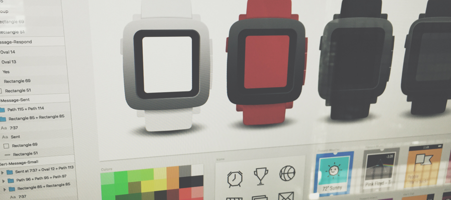
To get to that point, we recreated a lot of the screens you can see in the demo videos in Sketch. These assets were great references as we started to put together our own ideas for App Faces, Pins, Apps and Prototypes. Since we thought it’d be valuable for others, we’ve packaged up our Sketch Interface Kit for Pebble Time to share.
Keep in mind that the elements we’ve put together are based on video and image references (mostly at odd angles), so things like spacing, typography and other details may be off. Even so, the Interface Kit has already proved useful and we’re always interested in feedback.
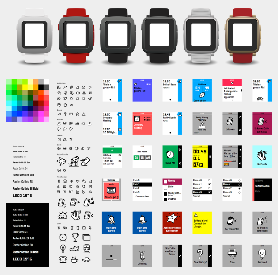
App Face Concepts
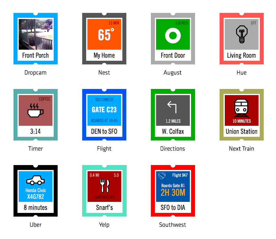
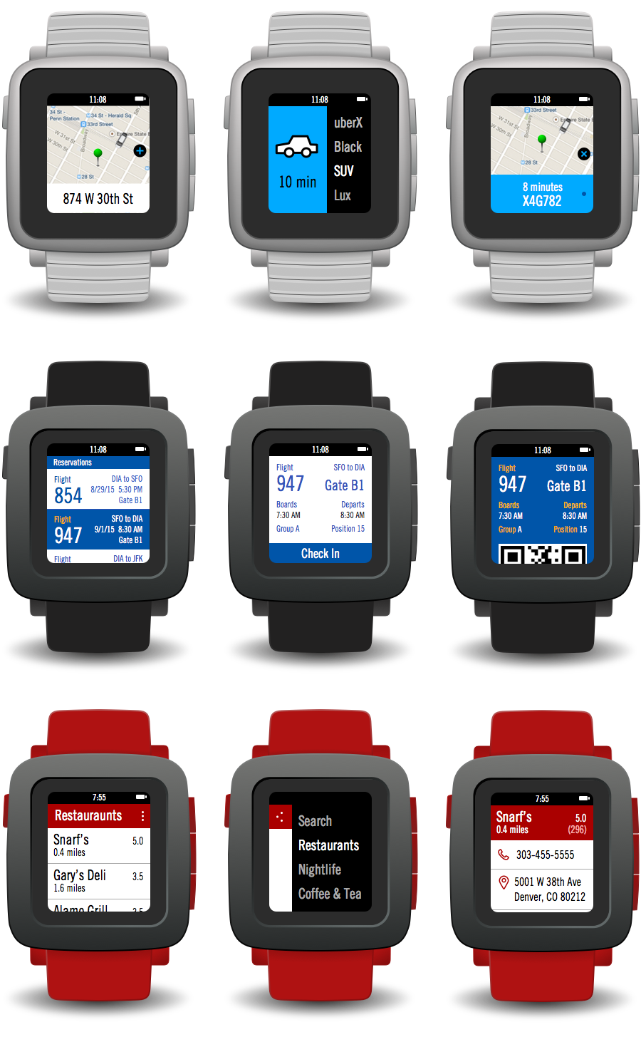
Using this Interface Kit, we were able to mock up some App Face ideas for things like Nest, Dropcam, August, Uber, and more. It was a fun exercise distilling down important information into a glanceable presentation that could provide value in a split second.
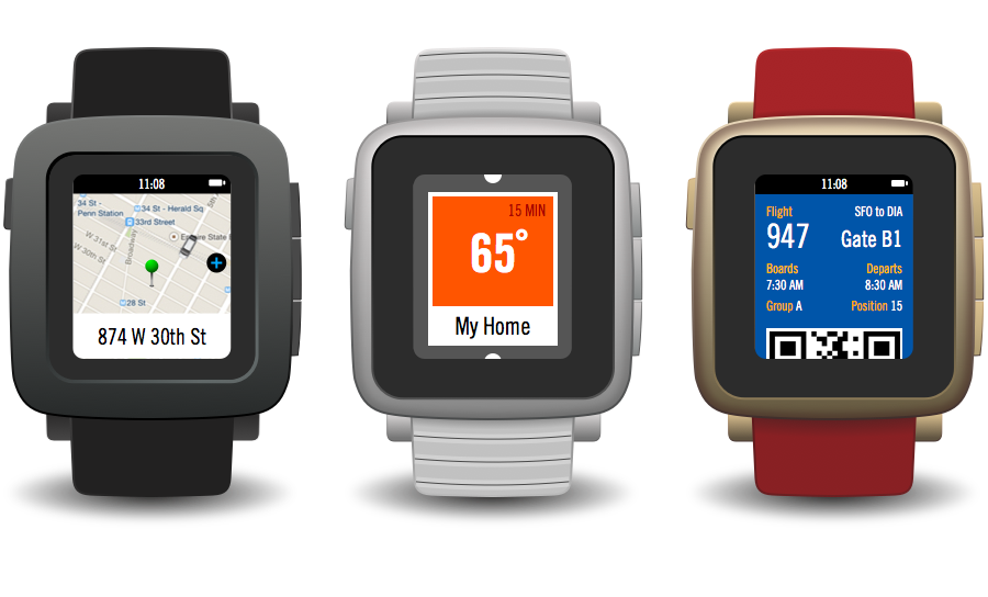
Apps for Pebble Time
Beyond App Faces, we were also able to test the Interface Kit by designing app concepts for Uber, Southwest and Yelp. The elements we had recreated made it easy to string together screens to illustrate these different concepts. We also developed some of our own patterns in the process, which we decided to leave out of the Interface Kit (for now).
Device Frame for Framer Studio
A major difference in the Timeline interface for Pebble Time is the use of animation. It’s just something that didn’t exist as much in the original Pebble Watch interface. Based on the videos, the use of animation looks playful, smooth and guiding. Because we use Framer a lot for prototyping, we thought we’d take some of our static screens a bit further into prototypes and include some animations that we thought might feel at home on the Pebble Time.


Part of this process included creating a frame for the Pebble Time that has buttons which represent the hardware buttons that you can press on the physical device, so the up, select, down and back buttons actually press in when you click them. You can also swap out the frames for the different Pebble Time models and use a module to get the current time.
Start Designing for Pebble Time
Until we’re able to get our hands on one in May, there are still a lot of unknowns for the Pebble Time. In the meantime, the Interface Kit and Device Frame may help get some initial ideas down and we’re excited to see what others create. As always, we’re open to hearing feedback on how we can make it better.
Be sure to check out the Pebble Developer Site for more details and updates, as well as the Pebble Time Design and Interaction Guidelines.
Note: This kit uses the Raster Gothic and LECO 1976 fonts. You can learn more about typography in the Pebble guides.