Garmin Pilot Redesign
Tack Mobile has evaluated and provided our thoughts on updates to the Garmin Pilot user experience and UI. Most significantly, we have changed how the user interacts with the Map and related Flight Plan functionality. Additionally, we have created new iconography for the Home navigation section, and modified the Navigation Bar. For simplicity, we have focused on the iOS version of the application.
As a team, we occasionally work on exploratory projects outside of our existing client work where we see challenging UX and UI problems we can bring value to. We hope this work is useful to the Garmin Pilot team.
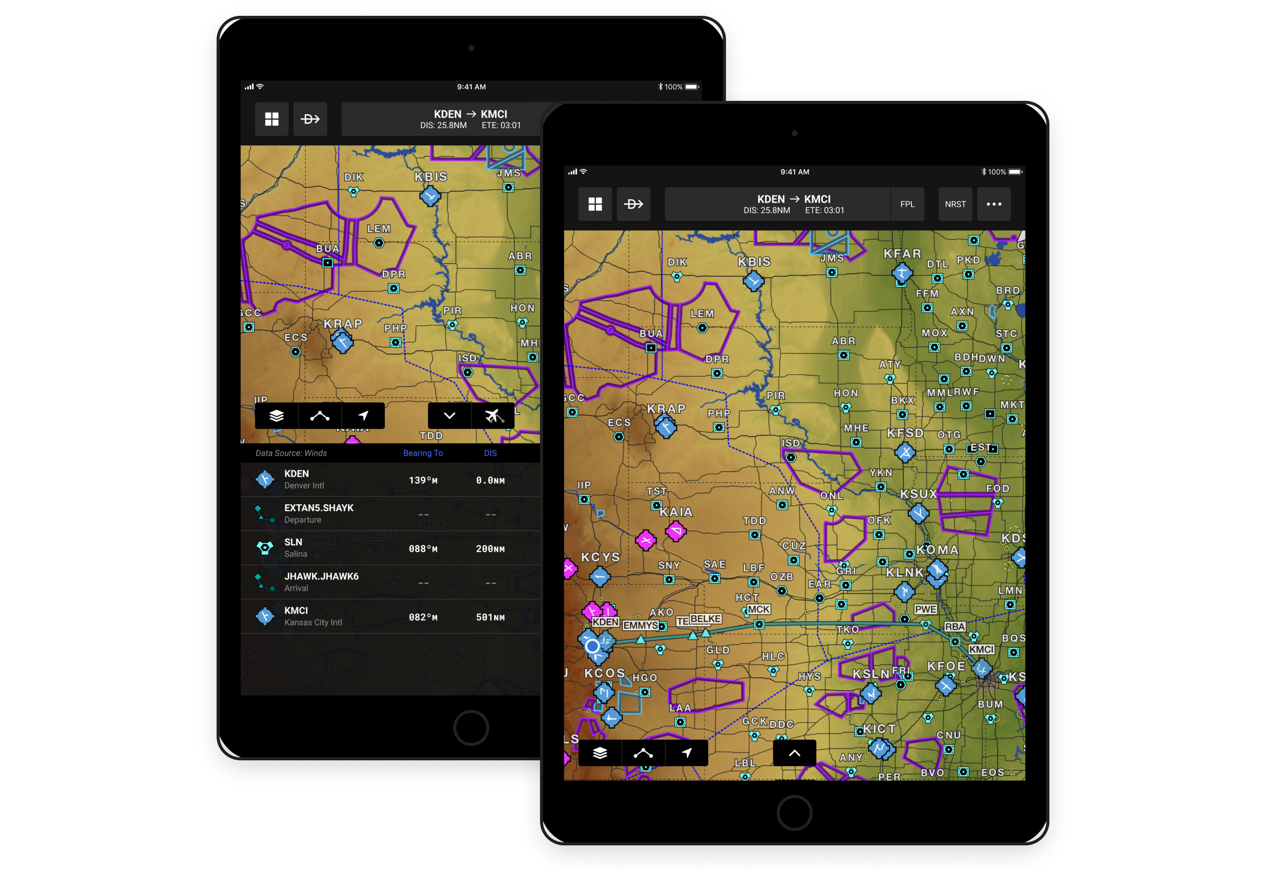
Map and Flight Plan Relationship
To simplify the common and interrelated use cases of viewing the map and flight plan, as well as viewing both simultaneously, we have explored several variations of this experience. We have more tightly integrated these views together while still maintaining sufficient logical separation to keep the two functions distinct from a user perspective. Emphasis was placed on keeping the interface intuitive, deliberate, and logical, while ensuring there is a justification when there is more than one way to accomplish the same task.
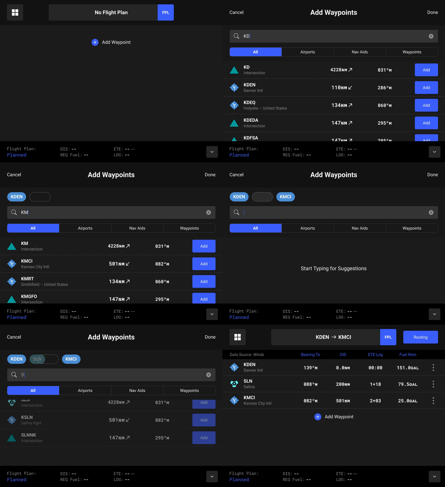
Enhanced Waypoint Searching and Editing
We evaluated how Flight Plan creation and editing could be made as fast and intuitive as possible while leveraging the available screen space. After investigating and experimenting with several different methods to edit flight plans, we feel this solution represents the best blend of differing UI strategies.
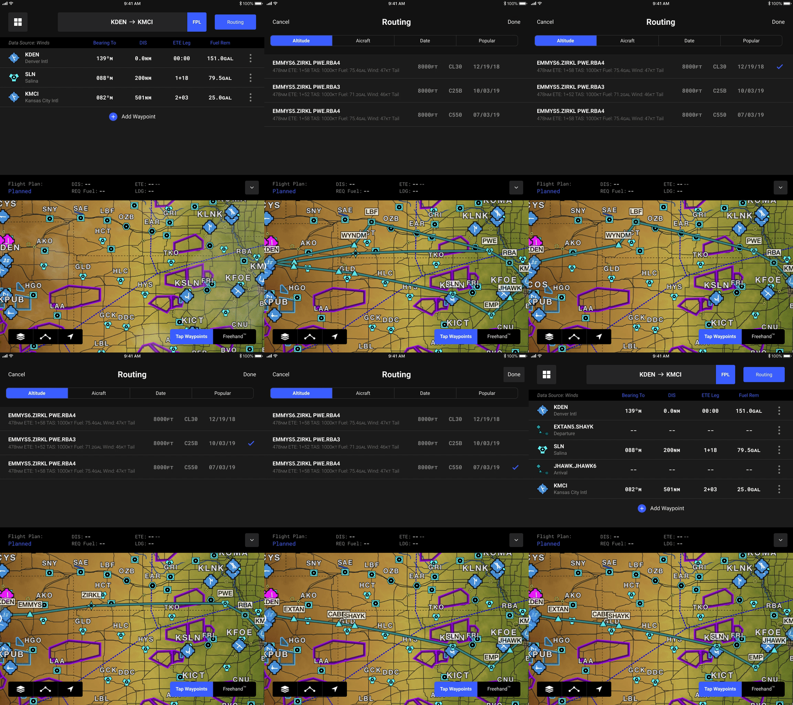
Routing
Viewing ATC approved routes in context, with weather and other overlays, eases the decision making process for GA pilots selecting their own routes.
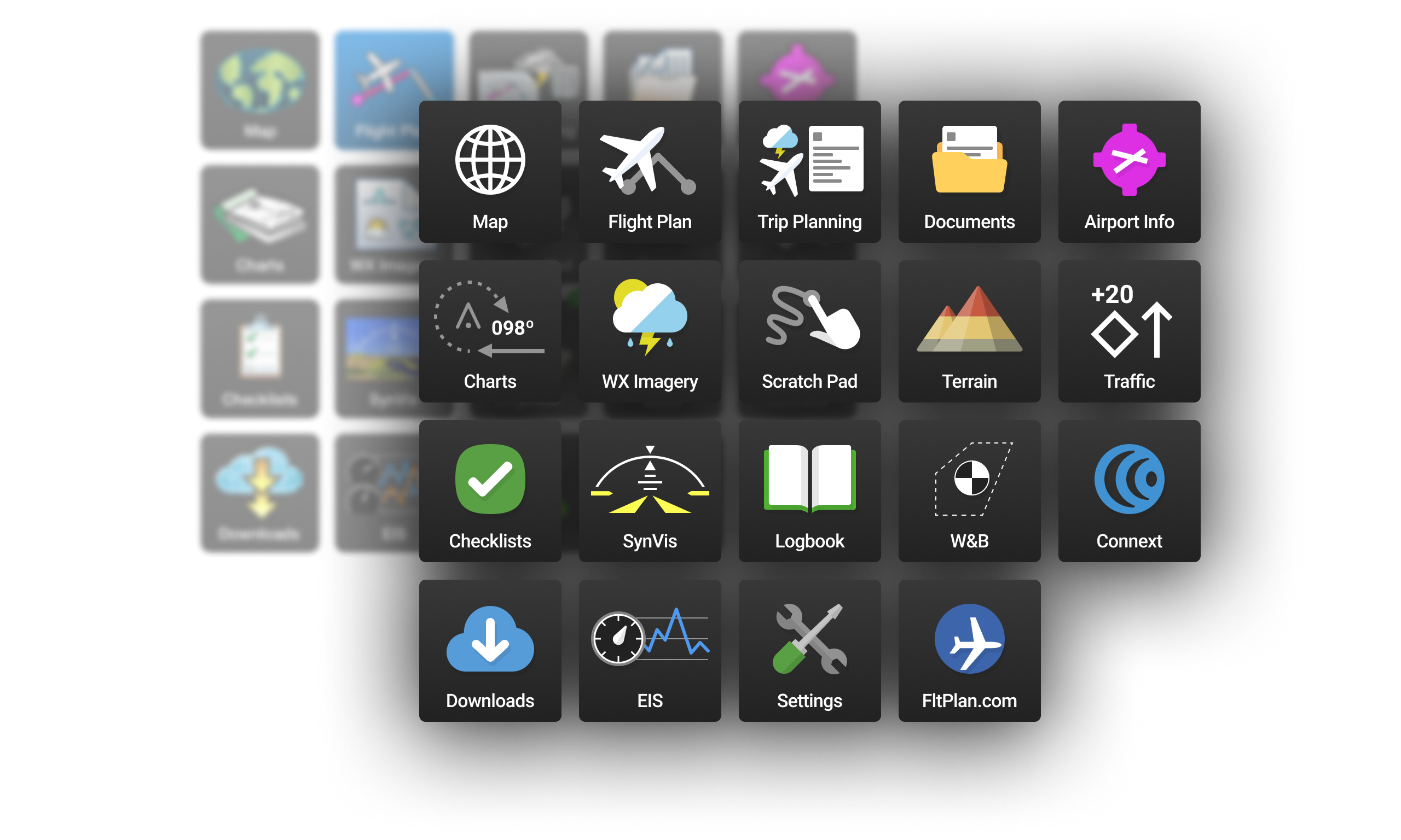
New Home Icons
The navigation icon set was simplified to give each icon a clear representation of each function. Elements were made larger in places with small details removed to ease icon recognition at a glance. Contrast and colors were also adjusted in places to help define a consistent look and feel. We have also considered sunlight and night readability, and simulated how these might appear on a GTN and sharper GTN Xi displays.
