Garage Door App Exploration
Design Team | 06/24/2020
Garage door openers are present in most homes. Integrating them into the IoT and home automation space presents several challenges: they must be convenient, secure, reliable, and safe. While many solutions on the market solve some of these issues, there is room for improvement in multiple areas. We dove in and took a deeper look at these challenges and presented some solutions.
Ryobi Garage Door App
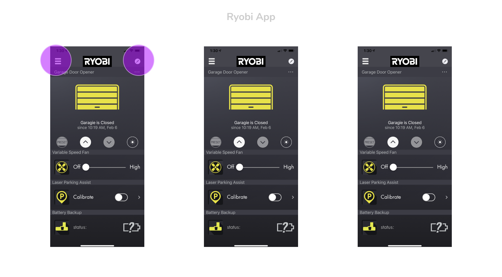
Out of all of the garage door apps we looked at the Ryobi garage door app had the most device controls with all of the physical modules you are able to attach to your opener. You are able to add a fan, CO2 detector, laser parking assist, music speakers, etc. With all of these add-on modules, it’s easy to clutter up the home screen with controls that compete with the garage door.
For our design concept we wanted to create a visual hierarchy where the most important features remain the most visible and it’s easy to navigate. The garage door controls are the most prominent on the home view and below that, you are able to scroll through any modules you have added. Illustrations were used for these that could also work as a visual queue for the status of the devices.
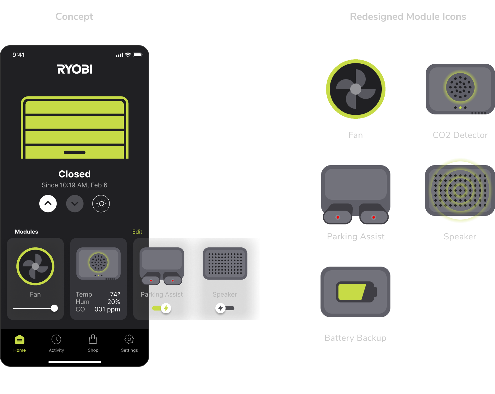
The main navigation was redesigned to include a tab bar to make the main sections of the app easily accessible. In the current design many sections are hidden in a menu bar so it required more digging around to find useful features. We broke these sections up into Home, Activity, Shop, and Settings. Shop was interesting in this case because one of the biggest benefits of the Ryobi system is the ability to add modules where you are plugging in physical devices to your opener. Having a section in the app where you can browse all of these seemed like a benefit from a marketing and user needs standpoint.
Genie Garage Door App
Compared to Ryobi, Genie’s interface appears less cluttered and narrows the focus to individual doors and controllers. However, the app lacks the ability to open or close any doors directly from the home screen. Tap areas also appear to be very small, which can become a usability issue if the user is trying to control the app quickly or with one hand.
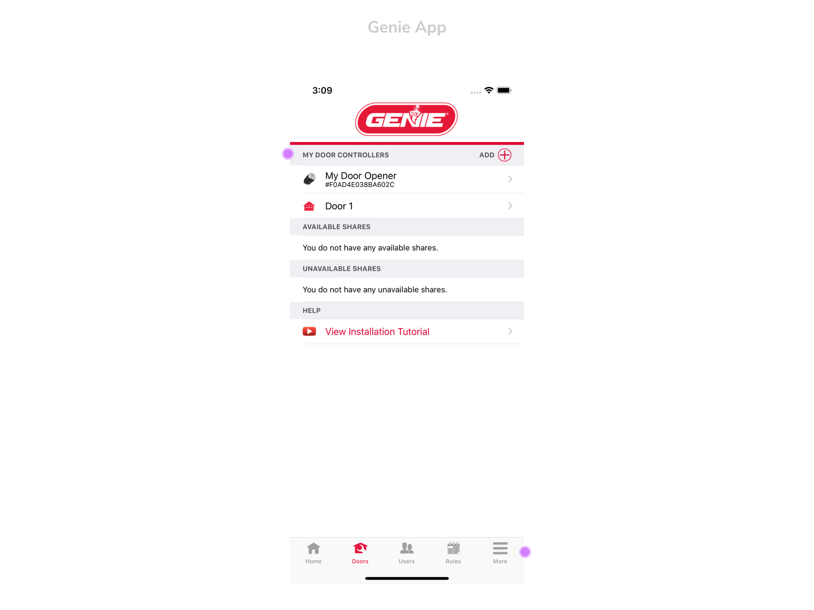
Our designs focused on allowing users to access the most essential parts of the app right away. Users are able to view the status of their doors and control them all from one single screen. We also kept the layout clean and spatious to allow for larger tap areas and a more focused user experience.
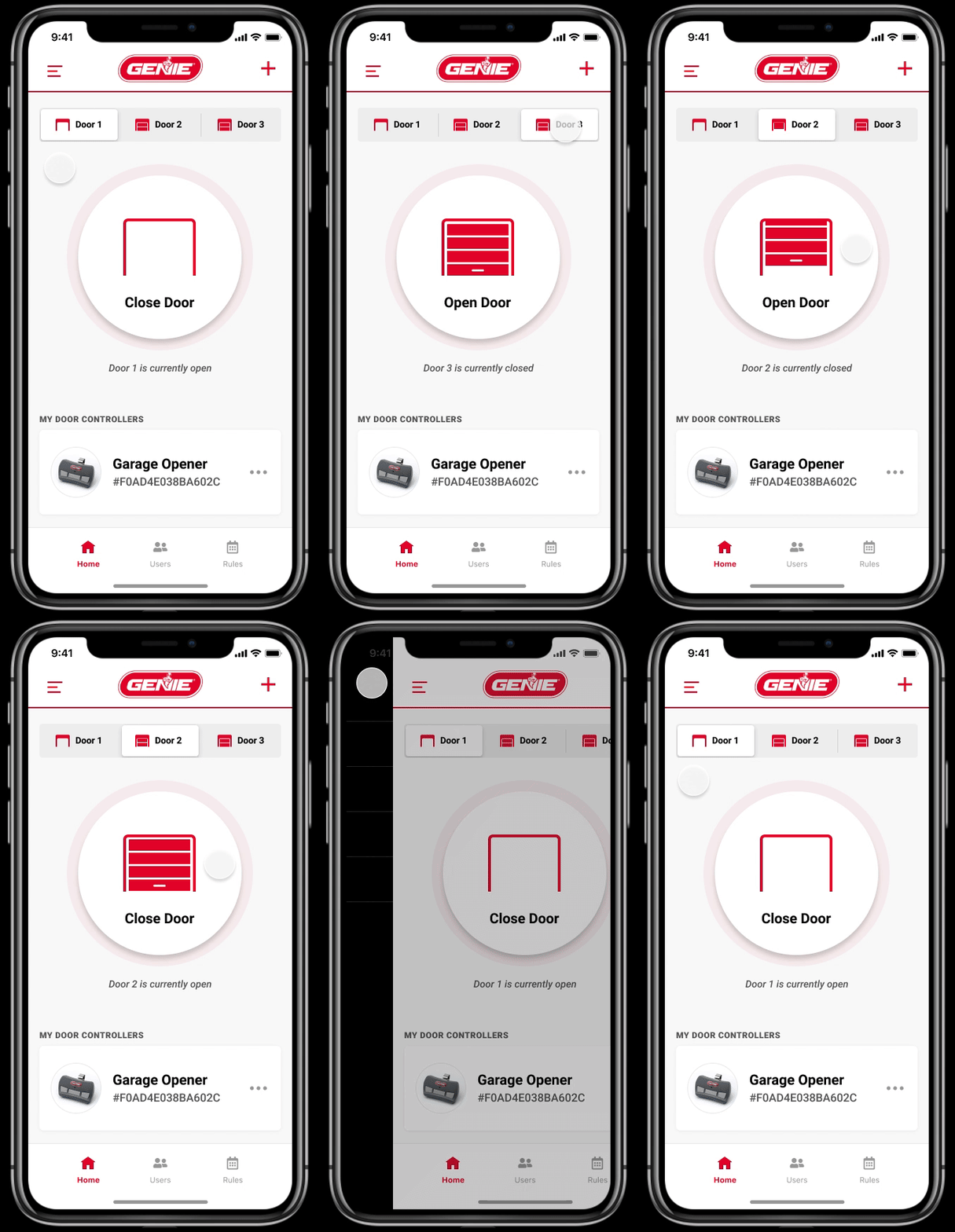
We also simplified the bottom navigation to 3 primary sections: home, users and rules. This allowed us to further focus the user on essential tasks and screens. All other menu options are underneath the hamburger menu in the top left corner.
Conclusion
Designing for garage door applications presented new and unique challenges, but many of the same design principles we use for different connected devices were able to be applied. For many users a garage door app might be used infrequently. It needs to be straightforward and reliable because fumbling with an app to open a garage door is the last thing you want. Some of the designs we explored are more complicated with multiple garage doors and additional add-on devices, but the primary function of the garage door is still the focus.
Please contact us if you would like to hear more about our design and development work in the IoT and home automation space.