Interface Origami
04/09/2012
In a previous post, I mentioned a way of thinking about interactions and interface within a framework of depth and space. The ideas were centered around the digital space, but as a designer I find it’s important to remove myself from that space and explore solutions that can originate in physical space.
One of the easiest ways to do this is to break out scissors and paper. With paper you can remove the constraints of working in pixels to fold, tear, flip, curl and manipulate the medium to discover solutions that may have otherwise been missed.
To illustrate this, I created a few examples based on some familiar apps and others based on former concepts I’ve played around with in the past.
Clear & Path
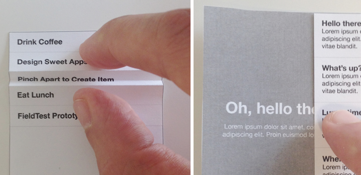
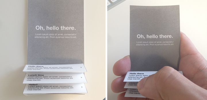
Clear has an interesting interaction where you pinch two list items apart to make room for an additional item. Path allows you to slide a view to the side to reveal additional content underneath.

Accordion
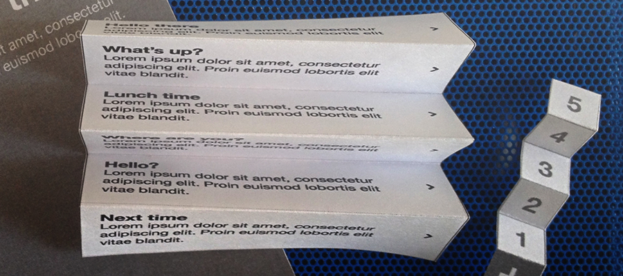
By folding paper like an accordion, you could see how you might collapse some list items to display content underneath. This could be triggered by a button or a gesture.

Fold & Peel
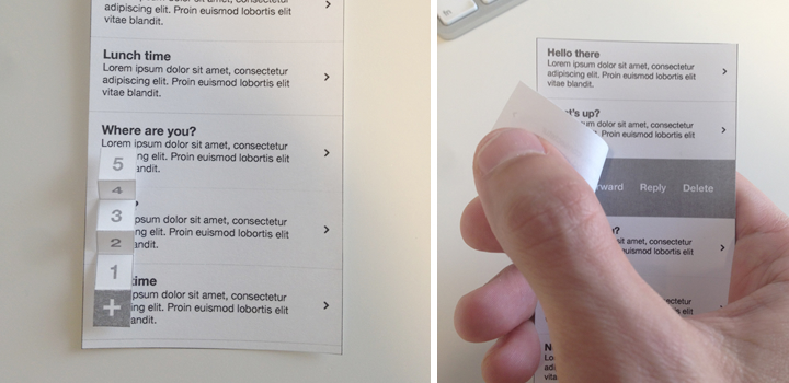
You could also use an accordion approach to reveal menu options. If you need to display options on a list item, why not allow the user to peel back a layer to reveal those options.

These are just a few examples of how playing with paper can really contribute to the design process. Whenever I’m trying to communicate an idea or working through solving a problem, I find pushing away from my computer and sliding over to a stack of paper for “craft time” can bring a fresh perspective.
Having a physical prototype also has the added benefit of putting something in your hands you can play with and evaluate. While a final design may end up as pixels, there’s a lot to explore beyond that.