Modular Design with Photoshop
10/13/2014
Over the past month we’ve been having internal discussions about design workflows and how we might be more efficient when it comes to working on large scale projects. Many of the projects we work on span across 100s of screen states and involve several team members. We notice any inefficiencies in our design process when projects reach this level of complexity, so we’re always looking for ways to improve.
We’ve brainstormed ways we wished our design tools worked to accommodate these large scale projects and operate in a more modular fashion. For example, libraries of assets, “componentized” design elements and a method of constant sharing amongst teams. A recent discovery has us excited about some new features in Photoshop that move the tool in that direction.
Linked Smart Objects
If you use Photoshop, you’re probably familiar with Smart Objects – nothing new there. However, Linked Smart Objects allows us to externalize Smart Objects into a folder we can share amongst our team. This feature has been around since the introduction of Photoshop CC 14.2, but we never fully incorporated using them until recently. Marc Edwards has a great write-up on this feature.
Smart Objects & Layer Comps
In Photoshop CC 2014, more new features were added. In another article, Marc describes one of these new additions:
Layer Comps and Smart Objects can now be used together — Layer Comps contained within Smart Objects are exposed to the host of the Smart Object, allowing many states to be saved within the Smart Object.
Say what?! Marc gives a very general example in his article and mentions thoughts for only a few other contrived examples, but we were immediately excited to hear of this feature.
Using this technique, could we, for example, make a Smart Object that contained a series of states for a button, or a series of avatars, or icons, or variations of other interface elements? What if we turned the Smart Object into a Linked Smart Object that could be shared with the rest of the team? Could this get us closer to our goal of a modular design approach?
We did a little more searching and found a few articles that seemed to answer these questions in a very positive way. As we experimented, we found we could split apart our designs into individual elements with their own variations and compose them together in our designs. It seemed like a very valuable addition to our workflow.
A simple example
To really understand how powerful this feature is, let’s walk through a simple example of a common interface element. How about an iOS switch interface element?
To get started, we’ll create a new Photoshop document that has two layers. One is of the iOS switch On and the other is in the Off state.
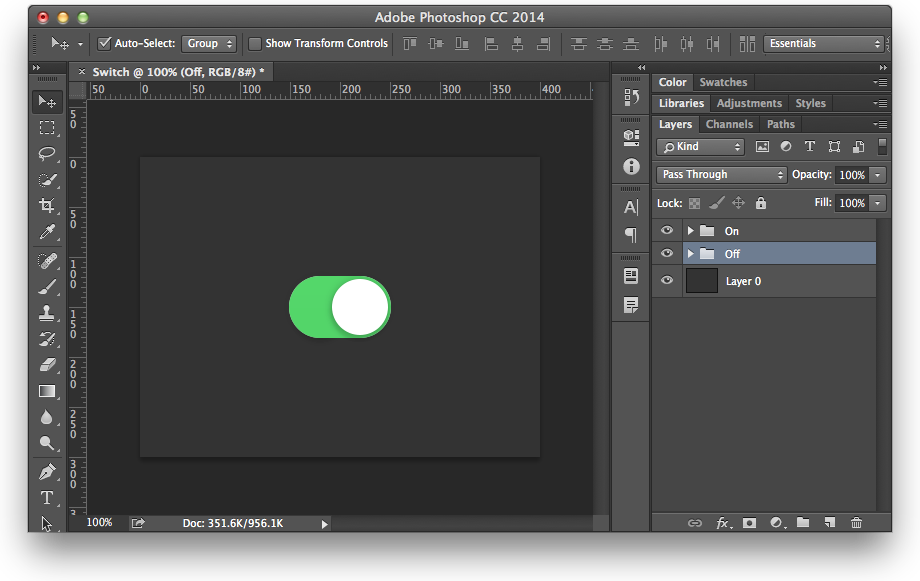
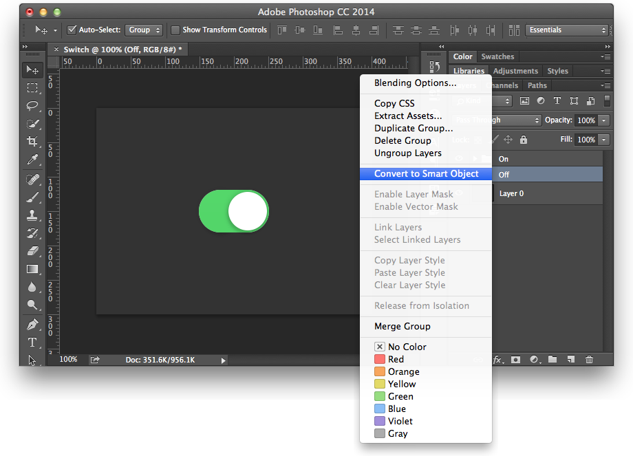
Now, we select both Layers, right-click and select “Convert to Smart Object”. The name of the Smart Object defaults to the top-most Group name, but we can change that later.
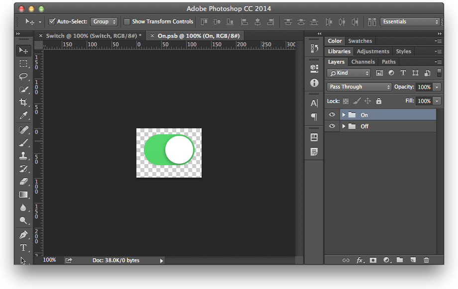
Double-clicking on the Smart Object opens the Smart Object as a separate PSB file. Within this file is where the magic happens. We’ll name our Layers as states of the switch, On and Off. This isn’t absolutely necessary, but helps keep things organized.
Now, we open up the Layer Comps palette and make sure the On Layer is visible. Clicking the Create New Layer Comp button brings up a dialog where we can name the Layer Comp and set some other options. We name the Layer Comp the state of the switch, in this case On, and check Visibility, Position and Appearance.
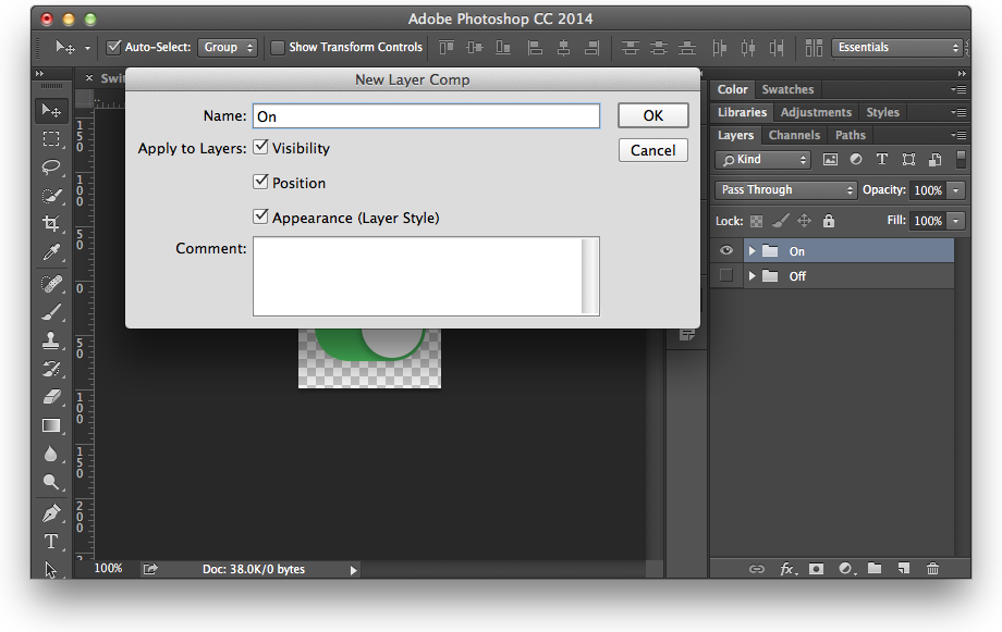
We do the same thing for the other state, which we’re calling Off, making sure the Off Layer is on and the On Layer is off. In our Layer Comps palette we now have two Layer Comps named On and Off.
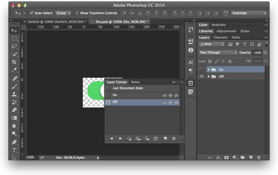
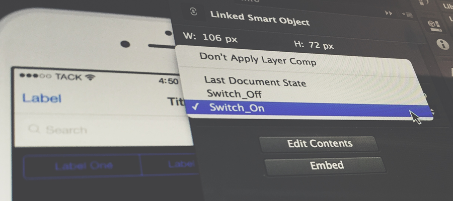
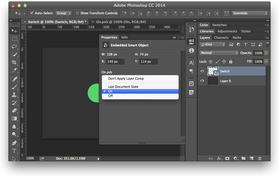
Ok, we have our “stateful” Smart Object, but to really take advantage of this work, we jump back to our parent Photoshop file that we started with. When we open the Properties palette for that Smart Object, we now have the ability to toggle the Layer Comps of that Smart Object. Amazing!
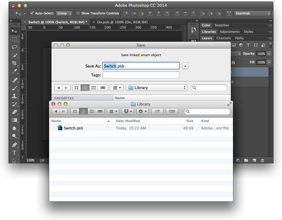
Taking this a step further, what if we make the Smart Object a Linked Smart Object, so the rest of the design team can take advantage of this newly created PSB. We just right-click the Smart Object and select Convert to Linked. Saving the Smart Object to a folder of choice, say on Dropbox, LayerVault, Creative Cloud, etc. and now we have a modular design element the rest of the team can use!
This discovery has already made us more efficient in our design process. However, be mindful of some of the caveats of using Smart Objects, as Marc Edwards calls out.
You can also do the same things that you have been able to do with Smart Objects, like Replace Contents to swap one Smart Object for another.
Give it a try
If you’d like to get an idea of how some of these elements might work, we’ve created a sample document that contains a variety of “stateful” Smart Objects and a folder of PSBs that are in that document that you can reference in your own PSDs. You can place a PSB via File > Place Linked.
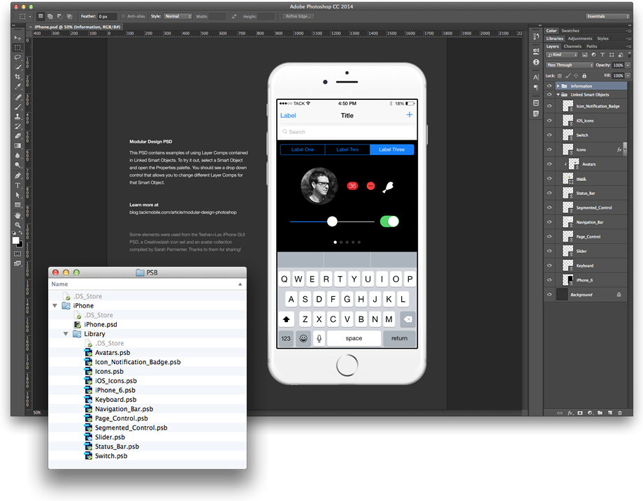
For these examples, we grabbed some elements from the glorious iPhone GUI PSD created by Teehan+Lax, icons from Creativedash and avatars compiled by Sarah Parmenter. Thanks for sharing!
Put it in a Library
Also added to Photoshop CC is a Libraries Panel, which you can access via Window > Library. A Library holds different design elements that you might want to access quickly later. You can store elements like colors, typography and graphics. Libraries can also be stored and viewed on the Creative Cloud website.
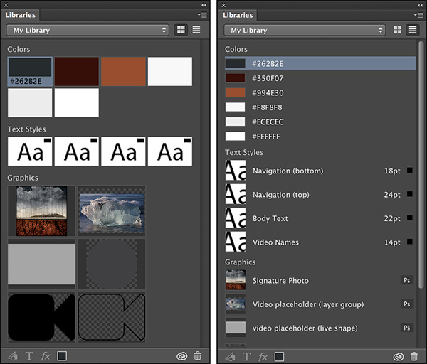
Image via Julieanne Kost
We were excited to see a Library could hold our “stateful” Linked Smart Objects, but it appears that any elements added to a Library are duplicated and stored in a completely different location that isn’t very easy to access. We were hoping we could create a Library that contained all the typography, colors and graphics that could be pushed to Creative Cloud and shared with other team members. That just isn’t possible at the moment.
Julieanne Kost has a more in-depth write-up on the new Libraries feature.
A great time for design tools
If you ever used Fireworks, there was a feature called Rich Symbols that did similar things, but it’s no longer being maintained. We’ve also seen interesting ways that InDesign can be used in a similar fashion. It’s great to see some of these concepts carried forward into the tools we use today.
In addition to Photoshop, we also use Sketch. What if you could create a Symbol and specify “states” of that Symbol that could be toggled from outside that Symbol? Or, similar to the way you can edit text per instance of a symbol, make other properties of that Symbol editable, like color, opacity, etc.
We also use Framer.js for prototyping, which relies on states for interaction. What if you could import PSBs to take advantage of the various states created using Layer Comps and programmatically toggle them for prototyping?
We’re excited to see how some of our favorite tools will evolve.