Pebble Time Round Interface Kit
10/19/2015

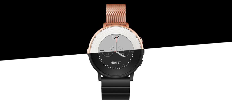
Last month, Pebble unveiled their latest product – the Pebble Time Round. Many have commented on one of its biggest features: that it looks like a watch. There were also some other changes to the hardware, including a larger screen, thinner form factor, and new finishes. All of these were interesting things to see in a world of so many smartwatch options.

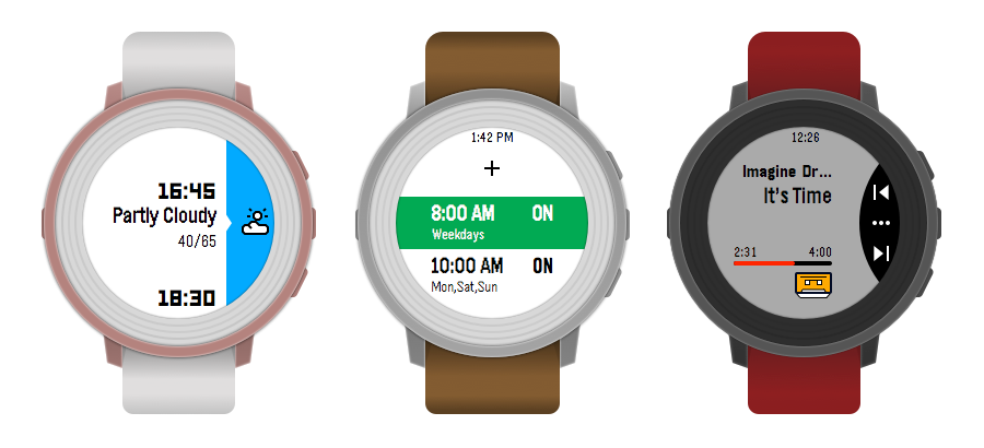
One of the biggest changes that we’re most excited about is the refinement and iteration that went into the interface to make the experience as best as possible on a round face. Rather than shoving a rectangle into a circle, a lot of thought was put into how to bring the unique interface that is familiar on the Pebble Time to the Pebble Time Round.

Making the Interface Kit
Since we released a fairly extensive interface kit for the Pebble Time, we thought doing the same for the Pebble Time Round would be a great way to learn more about designing for another new device from Pebble. As we began comparing familiar experiences on the Time to the Time Round, there were patterns to keep in mind — how people read a circle watch face versus a rectangular one, or how to work with similar content within a circle frame.

In addition to providing many core interface elements in the kit, we also took time to make it more useful. The kit is meant to be used with Sketch, so we added things like color swatches, symbols for icons and frames, text styles, and more. Adding this additional layer of organization has really made using the kit more efficient.
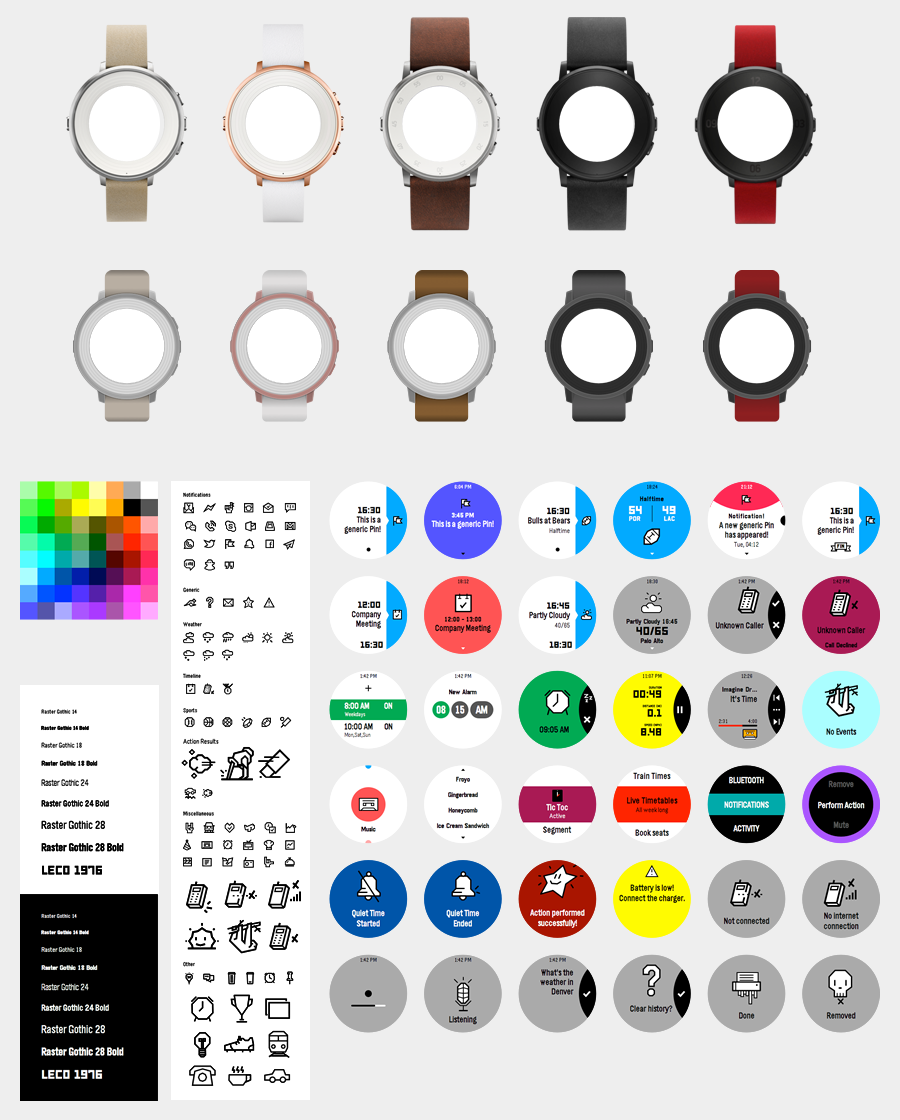
Overall, the Pebble Time Round Interface includes:
- Image and vector watch frame overlays
- 36 reference screens
- 80+ icons
- Color palette and swatches
- Text styles
We’ve had the opportunity to try the Pebble Time Round, and it’s a really compelling take on what a smartwatch should be, both in form factor and software. It’s also been interesting to see the positive reactions from people that have traditionally shied away from smartwatches.
Preview App for Pebble
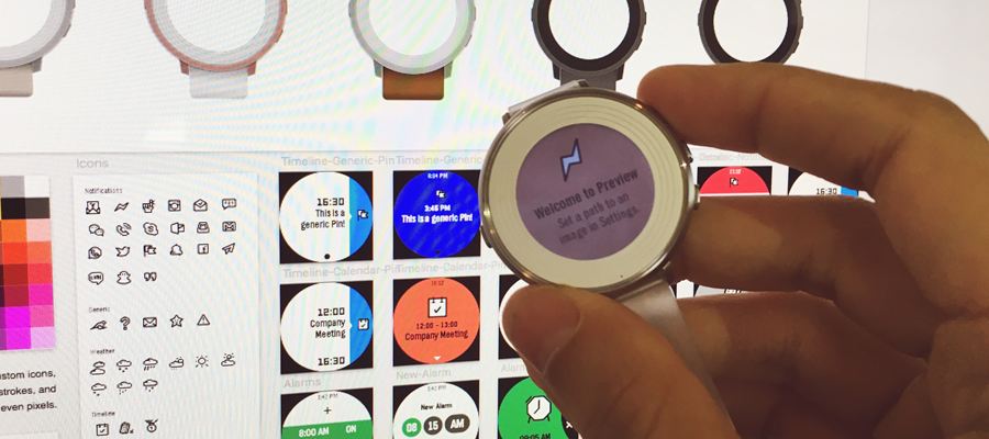
One thing we ran into while designing Pebble apps in the past is the time it took to preview our designs on the device while we worked. So, earlier this month, during the Pebble Developer Retreat, and with some help from a Pebble developer, we whipped up a proof-of-concept that allows you to preview an image from a local or remote server right on the Pebble. For example, you can export an optimized PNG to a public Dropbox folder, grab the link, and use it in the Preview app on the Pebble as you work.
So far, this has really helped speed up our design process, even though it only supports Pebble Time and Pebble Time Round for now. Product owners, developers and other stakeholders can preview our designs as we work as well, just by changing the URL to point to our newly exported design. We hope to speed this up even more at some point with a Sketch and Photoshop plugin, and live updating.
Note: This kit uses the Raster Gothic and LECO 1976 fonts. You can learn more about typography in the Pebble guides