Say Hello to Noted
12/13/2013
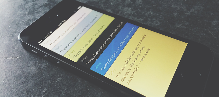
This week, one of our latest apps hit the App Store. It’s a simple gesture-driven note app for iPhone and iPod Touch called Noted. You may be thinking, “Does the App Store really need another note-taking app?” Well, we thought so.
There are a lot of really great and robust note apps already on the App Store, but we wanted to try and make something a bit more simple. Something akin to a stack of paper that’s sitting there waiting for you to capture any thoughts that might cross your mind.
Noted doesn’t support images, tags, markdown, an extended keyboard, etc. Notes are text on a surface with minimal interface elements. To keep the amount of interface elements to a minimum and maintain a hyper-focus on a note’s content, we implemented the use of gestures to perform common tasks, like creating a note, deleting a note, viewing a list of notes and more.
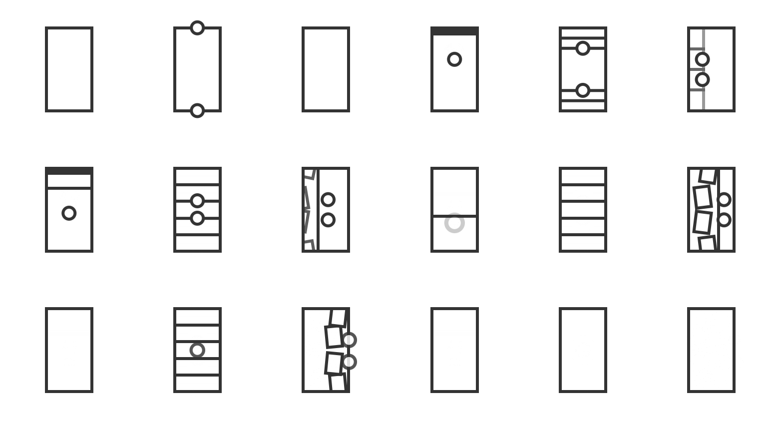
A lot of note apps follow a master–detail pattern of a list of notes that drill into a single note. This back and forth was something we wanted to try and improve upon, in addition to making things feel fast, like that stack of paper. You can swipe between notes or peek at notes for quick and easy review. Pinching a note takes you to a list of all your notes. Pulling down to create a new note, or, our favorite, a two-finger swipe to delete notes with a nice digital shred animation.

Another thing we really wanted to explore was creating a solid walkthrough for an app like this that heavily relies on gestures. Many apps present images explaining the gestures and hope a retention of that knowledge will carry into the app as it begins to be used. In Noted, gestures are taught by asking the note-taker to perform those gestures during the walkthrough in an effort to increase an understanding of how the app works.
Making something feel simple took a lot of work and elimination of a wide range of ideas. We’re really excited about how Noted turned out and can’t wait to hear feedback.