Tesla User Experience Concept
Design Team | 02/18/2020
The Challenge
We were trying to come up with a new way to navigate around the Tesla interface, while keeping the user interface consistent. The challenge was being able to show many panels without the content overlapping and hiding other important ui pieces.
Our Solution
We didn’t want to use overlays for this concept, always keeping the content in view. You can ‘long tap’ on the navigation elements to get a full view, and a ‘quick tap’ will toggle a split view. We started by creating a wireframe of the main UI structure and experimented with different forms of interaction.
After testing the wireframe prototype we put the ui elements in place to create a demo of what it would look like in a real user-case scenario.
Another Idea
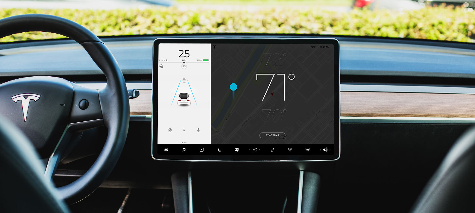
Another area we focused on was the temperature; currently when changing the temperature you press the left / right arrows to increase or decrease the temperature in the car. We wanted to make that more obvious by taking advantage of the right side panel, overlaying the map. You can tap the temperature icon, then swipe up or down on the overlay to adjust the temperature.
Allowing for larger control areas might improve the display UX by allowing the driver to adjust these settings without having to focus on very small tap areas. Once a control option is selected the display area is dimmed and reveals a large vertical slider for adjusting the setting. This concept could be enhanced in the future with tactile feedback like a vibration for each adjustment increment.
Swiping left or right transitions to a detailed control panel while keeping the navigation visible above. This helps provide an intuitive and consistent user experience. Familiar gestures enable clear interaction opportunities, such as swiping down to clear the panel.
Final thoughts
The Tesla UI is beautiful, with more focus on the user experience there could be less confusion navigating the interface.