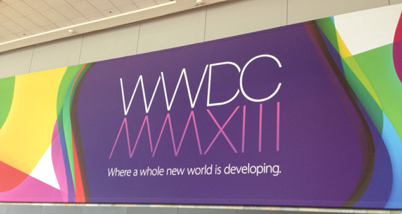
WWDC 2013
06/20/2013
Trying to sum up the week of WWDC is always a challenging task, but there was one pervasive thought running through our minds – the folks at Apple have been busy. While the opening keynote brought a handful of hardware announcements, and the unveiling of OS X Mavericks, the spotlight was clearly on the future of iOS. Below are our take-aways on what iOS 7 means for designers and developers.
Designers
There are three design themes that were used as the basis of the changes in iOS 7: clarity, deference and depth.
Clarity is achieved by making applications clear and easy to use, stripping away elements that are irrelevant and could keep the user from focusing on what is important. The design should make it clear how to use the application.
Deference is connecting the user to the content. This is evident throughout the system applications where most of the ornamentation has been removed in favor of clean, edge-to-edge design, and color is used to indicate both state and interactivity.
Depth in iOS 7 is achieved by making heavy use of blurring and transparency, as well as motion and dynamics, to create rich, engaging experiences.
Additionally, there is a large focus on typography throughout the OS, and making sure your application has beautiful type will be key to making it feel right.
Developers
iOS 7 might be the most impactful release for developers to-date. There are over 1,500 new APIs available – everything from integration with hardware game controllers and a full 2D game engine called SpriteKit, to a lightweight physics engine in UIKit Dynamics, bringing the capability to add motion and animation effects to any element in your UI.
To support each of the design themes, there are several additions and enhancements to the SDK. For clarity and deference, there are better methods of dealing with images and enhancements to auto layout.
Since depth is a fairly new direction for iOS, there was considerable time put into developer tools for this area. Whether the aforementioned UIKit Dynamics, or easier methods of capturing the screen in order to apply a blur and provide context for modal views, the bulk of a developer’s time acclimating to iOS 7 will probably be spent here.
Finally, to compliment the focus on typography, there are great new tools dedicated to text, including several system styles made to work beautifully with applications that allow the user to change text size.
And even if all of the new capabilities in iOS 7 and OS X Mavericks aren’t enough to get you excited as a developer, there are great enhancements to Xcode, the LLVM compiler, LLDB debugger, testing frameworks, Objective-C and much more.
Conclusion
If you design or develop for iOS or OS X, and have a developer account, you owe it to yourself to take the time to watch the session videos, and begin playing with the new tools that Apple has provided. It’s exciting to develop for great platforms and to be part of this developer community. We can’t wait to see what happens in the next year, and how these technologies will make an impact on our lives.