Designing a NASA Smartwatch App
09/17/2015
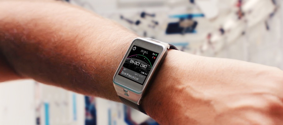
Recently, NASA created a design challenge for a smartwatch app to make life on the International Space Station easier for astronauts. The request asked designers to consolidate various types of functionality from some existing desktop apps into a well-designed watch app.
We love discovering innovative ways technology is being used in different professions around the world – and the cosmos! The challenge got us all excited, so we decided to take part and see what we could produce. While the project was open to submissions for a month, we were only able to jump in during the last few days, which meant it was crunch time.
What NASA asked for
The main idea of this challenge was to take existing and very complex laptop programs astronauts are currently using and translate them into a single smartwatch app that helps astronauts perform their tasks more efficiently. NASA required that the app would be designed for the Samsung Gear 2, a watch which has its own set of OS patterns and paradigms to adhere to.
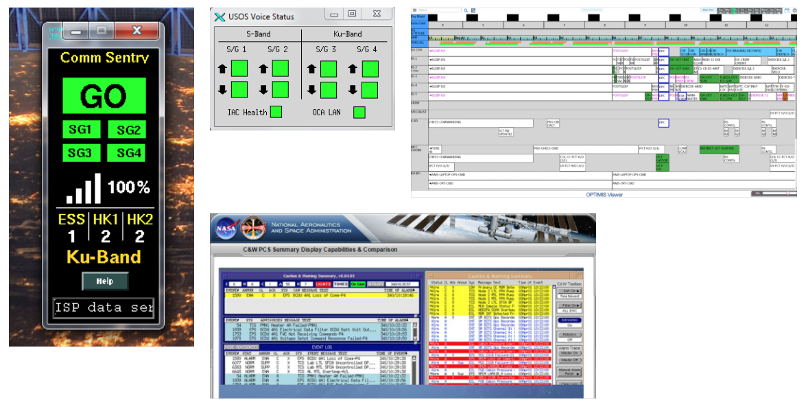
NASA outlined four main functions the app needed to perform:
Timeline
Display a crew member’s agenda for the current day or past/future days.
Caution & Warnings
Display three severities of warnings in associated colors.
Communications Status
Displays current communication status with ground.
Timer
Allow crew members to set timers and stopwatches.
Our approach
First, we combed through the existing apps NASA provided to discern the most important information for each task. Once we had that information, we sketched out a basic user experience flow so that we could organize what needed to be shown on each screen.

We then moved along to designing high-fidelity wireframes for our different sections. We played around with different color schemes and possible interactions.
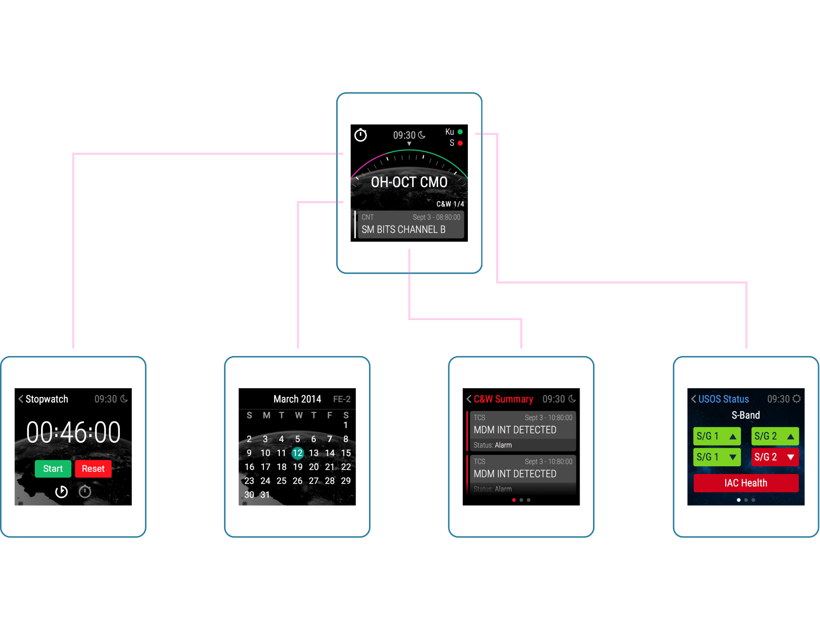
Designing for a watch presents unique challenges. With a small screen, it’s important not to crowd a view with too much information that may not be relevant and carefully consider how to spread out the experience. Additionally, making sure there are adequate affordances should be top-of-mind, especially for different sized fingers.
Working through challenges
Of course, every great competition has its challenges and this one was no exception. The most obvious challenge we faced was not being able to imagine life as an astronaut or understand technical information in the same way they do. Much of this information was presented using specific colors that astronauts have been using for years, so we had to design something that wouldn’t clash with these colors and would also make them stand out.
Another challenge we faced was the vagueness of the brief. NASA intentionally left it this way because they wanted to challenge designers to figure out, without bias, the best way to organize and display data in such a small screen.
What we came up with
Throughout the design process, we looked at the challenges we ran into as opportunities to explore and grow as designers. After a quick two day sprint, we delivered a solution that can help successfully communicate the most vital information to astronauts. Our final presentation was in the form of slides that show each section of the app with a brief description of the interactions and information displayed.
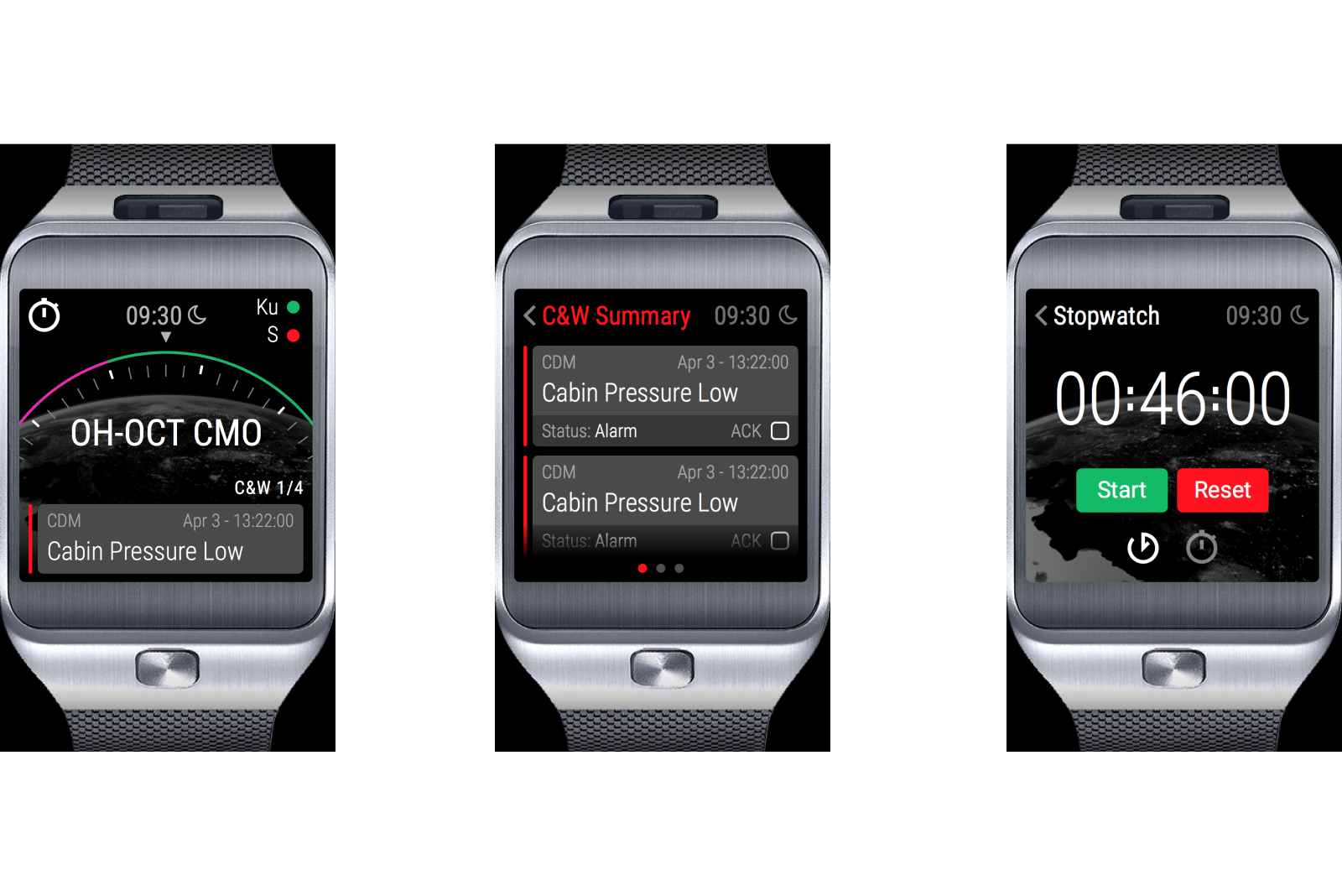
We designed a dashboard view that shows the current task, time, communication status, and warnings at a quick glance so the astronauts always know what they should be doing and what is going on in the space station.
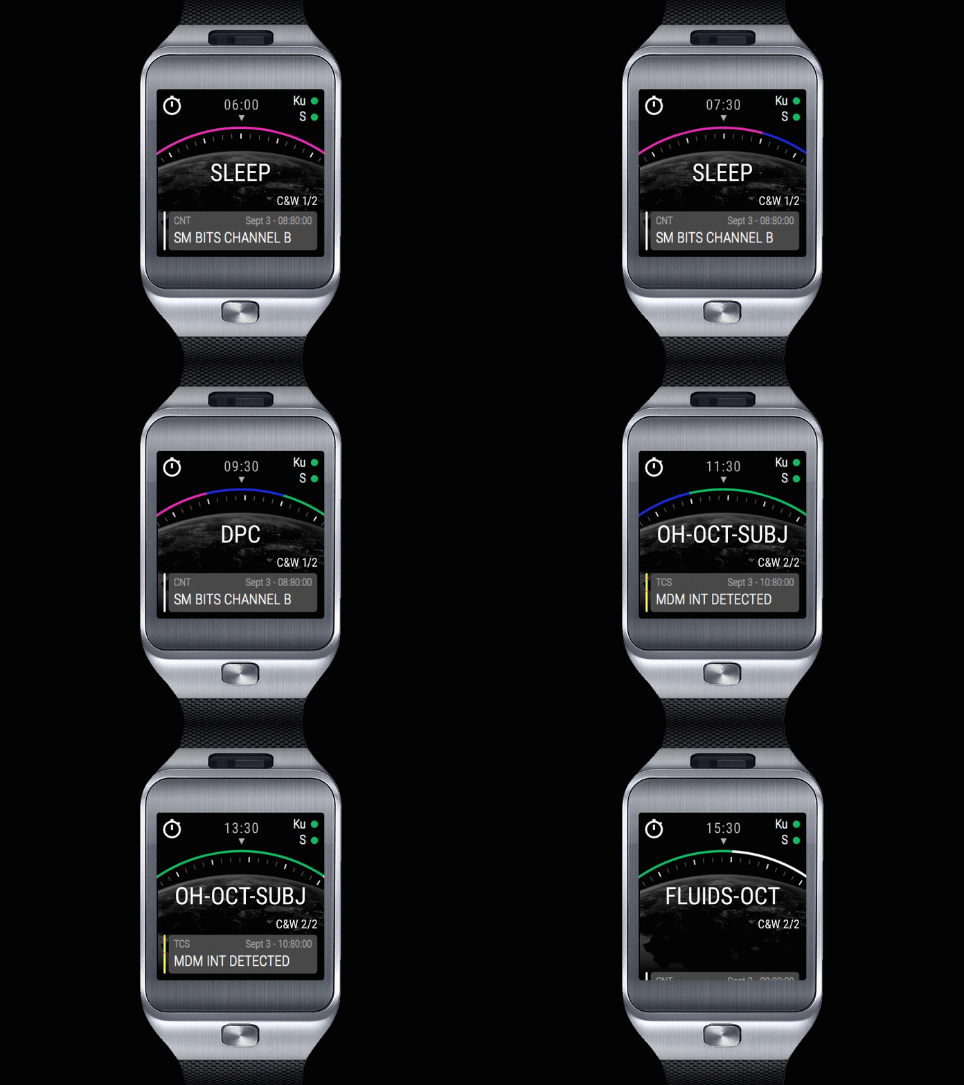
We had a great time learning about a new application for smartwatches and challenging ourselves to take large amounts of data and display them on a small interface. While we know there were about 237 entries for this challenge, we’re excited to participate and happy about what we were able to accomplish in such a short amount of time.