Prototyping Animation
10/04/2012
During a recent project, our design called for a custom animation that was tricky to explain via static screens and description. Storyboarding was an option, but we’re big fans of getting ideas on a device as much as we can – quickly.
In the past, jumping into Flash Pro would have been a quick win, but we really needed something that could be viewed on a mobile device, in this case an iPhone. Using HTML, CSS and Javascript seemed like the way to go, so we immediately decided to give Adobe Edge Animate a try.
It worked out great.
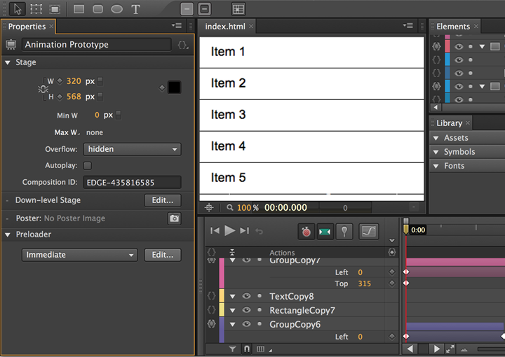
The process was pretty straightforward and quick. Jumping into Animate felt familiar to Flash Pro, with a timeline, the ability to add objects and tween them. That’s all we needed.

We drew out our interface, which at this point was in a wireframe state, and imported some other graphics. Once the starting part of the animation was composed, we tweened those elements to illustrate moving into a different state of the app and triggered the animation using actions, like “click”.
The process was pretty straightforward and quick.
Along the way we were able to preview the animation in a desktop browser and on an iPhone using Adobe Edge Inspect. For an added bonus, and before we shared the animation prototype with the client, we added some meta data and images to fit the prototype to the device, this allowed for fullscreen and bookmarking to the iPhone’s Home Screen with a custom icon.
Tip: If you want to make your web app run at full screen on an iPhone 5 with a splash screen, we found this handy post.
The results of this quick experiment were great! The client immediately understood the animation and interactions associated with it. For those who were unable to test the animation prototype on a device, we made a quick video that could be watched at a convenient time.