The Practice of Prototyping: Part 1
Patrick Hansen | 01/10/2017
Intro
In many industries, prototyping is a necessary aspect of the “create and build” process. Prototypes are used for multiple reasons from research to concepting, and from demonstration to communication. Depending on the industry or goal, prototypes may come in a variety of forms, use different materials, or take advantage of different approaches.
It can be a challenge to choose the “best” way to build a prototype, so we’ll break down some fundamentals of the process. No matter which approach you take, the end goal should be a high-quality, useful deliverable. This guide will focus on prototyping concepts for software and interfaces, but many of these ideas can be applied to hardware and other types of products.
This three post series will cover the following:
- Part 1
- Why Create a Prototype
- Defining an Objective
- Presentation
- Fidelity
- Part 2
- Team & Project Resources
- Prototypes & Production
- Feedback & Analysis
- Part 3
- Conclusion
- Helpful Tips
- Tools & Resources
Why Create a Prototype?
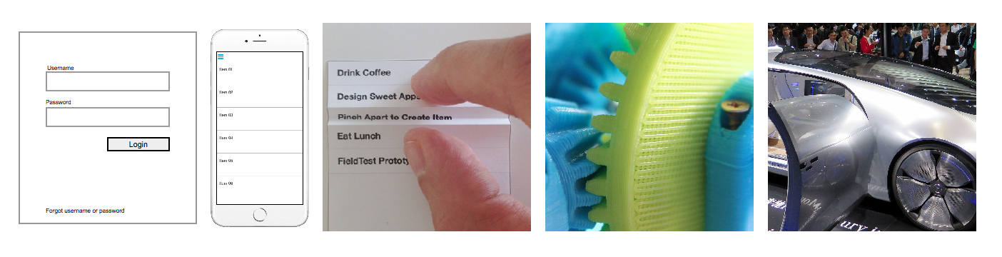
There are many reasons why you might want to create a prototype. A prototype may be required to be put in front of people in an observation lab to perform testing on functionality and design. Some prototypes may be used more as a demonstration to help sell or communicate a concept to other people; stakeholders, team members, customers, etc. Or, a prototype might be created as a proof of concept for a new and unique idea. You could also use prototypes to do comparison explorations and A/B testing.
Defining an Objective
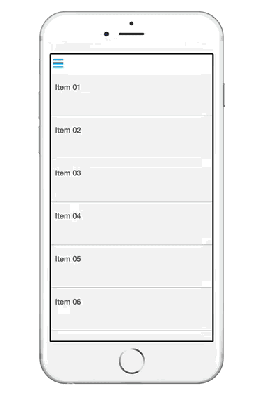
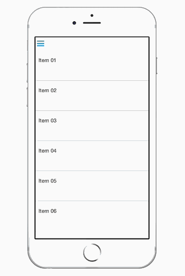
One of the most important things to consider when creating a prototype is your objective. Plan upfront on defining what you would like to gain or learn from creating this prototype and who is the audience. This can help you stay on track and remain on schedule. There are many definitions and interpretations of a prototype. From a series of rough napkin sketches to a fully functional web app, I have received drafted expectations that were only considered a “prototype” until it was shipped to market. Just as you would do with any project, set clear expectations upfront to avoid any confusion and miscommunications with your teams and/or clients.
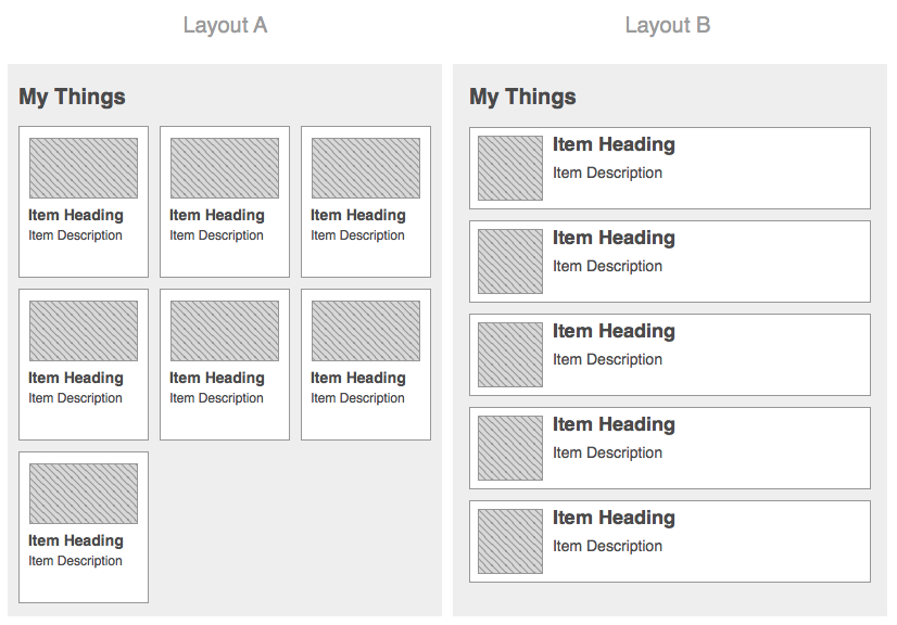
The above image showcases two list presentations, a tile list (Layout A) and a vertical list (Layout B). They are done in a very coarse wireframe style, and the objective is to compare the two list presentations and obtain feedback between the two approaches, not on aesthetics. This is an example of a typical A/B test, where multiple solutions are presented for usability testing to determine the best approach.
Presentation
Prototypes often yield the best results when they are presented in a form that closely resembles the actual target device or platform. This approach can also help reveal issues that were overlooked during the initial design process. However, if your concept is a smart phone app, you don’t actually have to build it in the device’s native language in order to present it on one.
If you have constraints that prevent you from building a prototype on the same target platforms for the final solution, there are many tools and ways that may be used to simulate a “native” solution through web browsers, prototype apps, document readers, or even photo applications.
Fidelity
Prototypes come in all shapes, sizes, and fidelities. A prototype’s fidelity may have a large impact on process, schedule, and budget. It may also impact your testing results if it is not implemented appropriately. To optimize efficiency, it’s important to understand the definition of “prototype fidelity” and the requirements you are aware of at the time. Fidelity can span across visual appearance, interactivity, motion, and even content.
It’s easy to naively believe that the prototype needs to look and behave exactly like the final product at all times. This might be true in some cases, but plenty can be accomplished with low-fidelity simple wireframes or sketch-style screens stitched together with minimal interactivity.
There are times when more fidelity may be needed to help clearly communicate more complex functionality or interactions.
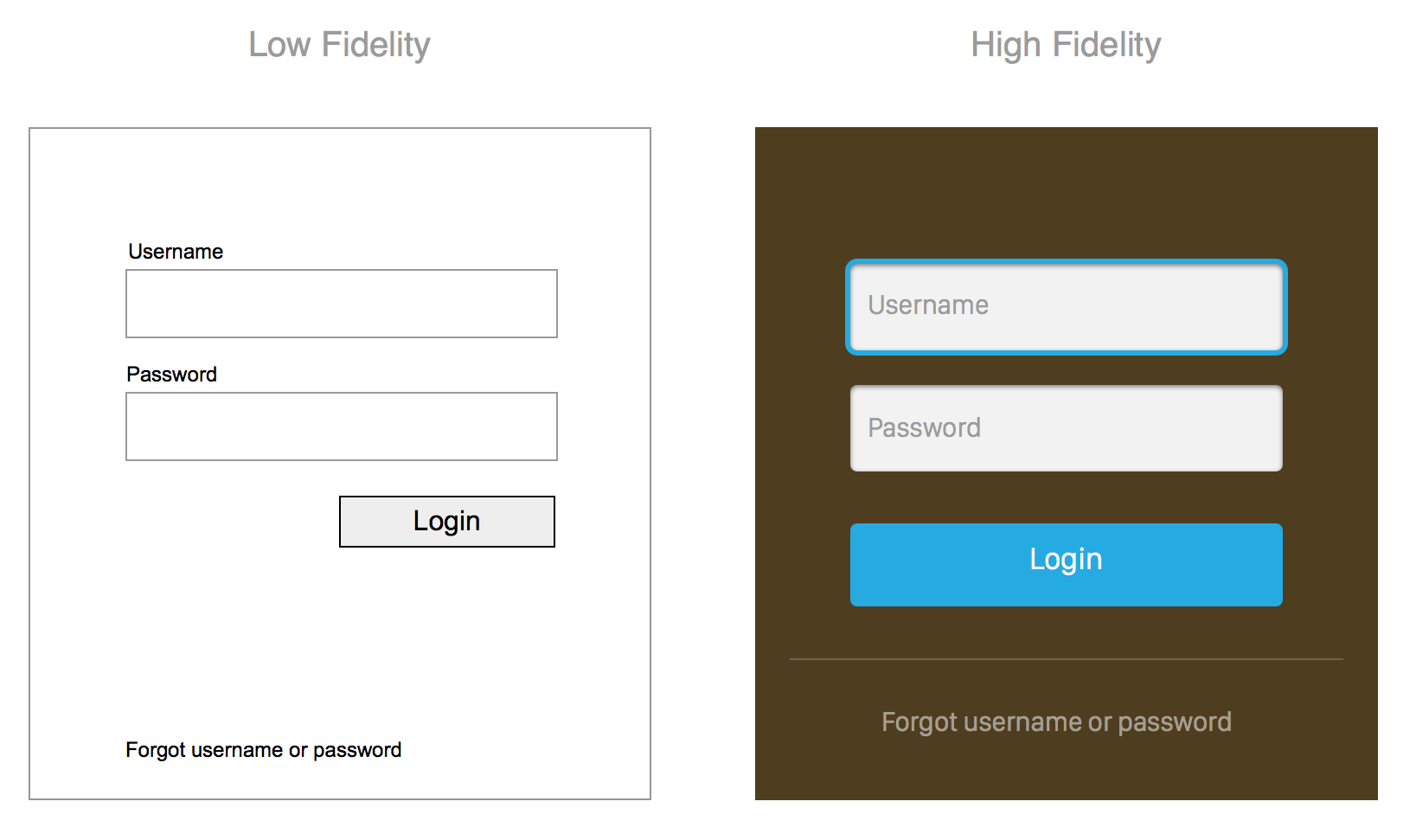
The image above shows a login form in visually low- and high-fidelity formats, respectively. Both communicate relatively the same content and information, however the high-fidelity version (right) is more stylized with some visual design applied to it. The low-fidelity wireframe view (left) likely took less time to create than the other - in more complex views this can be a considerable time saver. This demonstrates a scenario where visual fidelity may not have a large impact on representing the functionality required in the view. Low fidelity may also be more beneficial in preliminary reviews and testing to reduce potential distractions related to visuals like colors and branding.
Visual Appearance
A major factor that may affect efficiency when creating a prototype is the visual appearance. Keep in mind that all aspects of design can be a crucial influence of feedback. If you can determine what is absolutely necessary for your objective, you may decide if a high-fidelity prototype (showing colors, branding, etc.) is needed to accurately gather input from the users.
Sometimes the true functionality can be separated from the visual design and may have little or no impact on testing or feedback. A simple low-fidelity presentation may be sufficient to address the items in question.
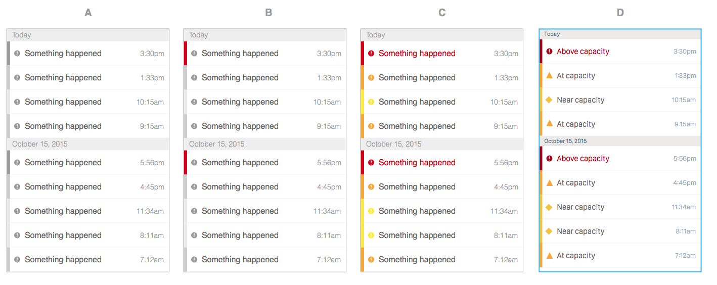
The image set above shows various fidelities of a notification list with three levels of urgency: low (yellow), medium (orange), and high (red). If your objective is to determine if a user can recognize and comprehend the level of urgency between the various list items based on color, gray scale may not be enough to communicate that effectively, since there would only be three shades of gray.
In the first image (screen A), the user can probably tell there is some type of difference between the dark gray verse the lighter gray indications along the left edge but may not be able to distinguish the urgency type based on those shades.
This is a case where you may include additional fidelity simply as some color in a grayscale wireframe. In the second image above (screen B), I have added the color “red”. This may help the user quickly identify the higher urgency items at a glance but still leaves the other two levels a bit unclear.
The third image (screen C) introduces colors for all three levels of urgency, “yellow”, “orange”, and “red”. With this presentation, it is more likely that a user will recognize items with a high level of urgency in addition to distinguishing those items of the low and medium level urgency.
In addition, this is also a good example of how using only color as an identifying dimension may not be enough to communicate to all users when you consider accessibility and other factors that could distort or impact color recognition. In the last image (screen D), we have introduced a little more color, styling, realistic content, and also changed the icon shape for the different urgency levels to add another dimension of identification. Even without color, the user likely could distinguish that there are three different levels of urgency based on the three different icons alone. The added color provides that additional level of detail that can really help define the level type. The label text can be considered another identifier.
This also represents a good time to call out esoteric considerations that not every person may be aware of. The user in this situation would likely have some type of prior knowledge or context of the meaning of urgencies and the colors. This is important when defining the criteria for your audience if you are putting this in front of users for feedback. (note: This color palette was only used as an example and you should also exercise considerations for other cultures or languages, since they could have a very different context in other countries.)
Interactivity
When actual users are involved, the prototype will likely need to incorporate some type of interactivity, which in turn may require some additional efforts on top of design.

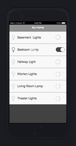
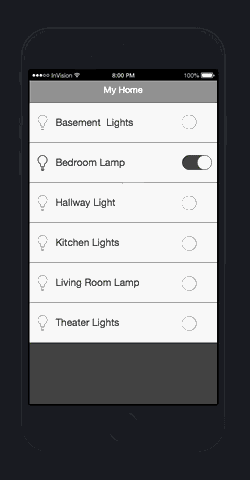
The video above shows an example of some wireframe designs for a smart bulb phone application. The designs are static designs created in Sketch, exported as bitmaps, and then stitched together fairly quickly in InVision with some of the tool’s standard transitions and basic interactions.
Adding interactivity allows users to engage with your prototype in a real-world way as far as navigating through screens and performing realistic actions. Even if the interactivity is simply clicking or tapping to progress through static images of views, that level of interactivity is still very powerful to achieve quality testing results. It can also come at a low cost depending on the tools you are using. You want to make sure there is enough interactivity to communicate the experience properly without gaps that can disrupt and skew feedback.
Complex interactions are costly to create and therefore, I recommend to only take the time to have these in your prototype when demonstrating a unique or new interaction - or when it is worth the extra effort to get the design as close to the intended design as possible. A prototype may just be solely used for testing or demonstrating a unique or new interaction, and the interactivity may be focused only around that.
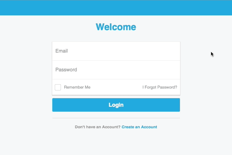
The screenshot above shows a typical login form, but we wanted to explore the float label pattern that designer Matt D. Smith shared on his Dribble account and then had gained some traction from Brad Frost and others in the industry in the past couple of years. This prototype didn’t actually log into anything as we were just focused on how the float label pattern would work and how users would respond to it. It was built with HTML/CSS and Javascript. This concept would have been difficult to convey using just static screens.
Depending on the tools you use and resources available, the level of effort required to implement varying levels of interactivity can be quite low or can be exponentially high. This is where choosing the right tool and platform is crucial for scalability.
You may not need to include every single view or interaction in a prototype, especially for features that are not of immediate/primary concern. It is easy to get pulled into creating a very robust prototype that can demonstrate the system in its entirety, but remember to stick to the objective.
You could also perform usability research on something that has no interactivity at all if you are simply testing visual layout and information presentation, such as placement of a button, text legibility, or even colors. This is a simple visual comprehension, reaction, and response.
Motion
Transitions and animations can be used in a higher-fidelity prototype. Before spending the time to incorporate these elements, be sure they are necessary and meaningful. These types of transitions are usually related to flows where it is important to communicate the orientation from one view to another or one interaction to another. It should also provide some value to the user by being performed.
Traversing between multiple nested views or revealing a navigation drawer are common scenarios where it might be important to help visually communicate where the user is coming from and going to. This helps provide contextual relativity between various views and sections of the app.
The two animations above were created in InvisionApp with some wireframe designs from Sketch. The one on the left uses a push-left and push-right transition as you dive in one level to the detail view and then back out. This helps illustrate and orient the user, especially when using a back-button navigation pattern.
The animation on the right shows instantly changing the view or state to another view and instantly returning back without any transitions. The lack of a transition can be a bit abrupt to the experience, and it can feel artificial.
A detail like this may not be critical to a prototype, but it all depends on what you are designing for and testing against. This interaction may be all that is needed to determine that the user knows what they are engaging with.
On the other hand, some transitions/animations are not core to the experience, but still function and add value as “delightful details” or simple “eye-candy.” For example, something like animating an icon from one view to the next. The animation is not crucial for a user to accomplish the task at hand, but it is a nice detail to enhance the visual experience.
There are some tools that allow you to add common transitions and animations between views very easily. Then there are tools that allow you to create practically any motion effect you desire, but it may come at the cost of custom development or production. Consider the value or need for motion in your prototype before planning on introducing it.
The animation above shows a prototype that was created with FramerJs in Framer Studio. All of the content in the screen is created with code, but you could use bitmap assets as well. The navigation drawer sliding into the screen is an example of a transition that has more importance to the experience. Rather than just instantly revealing a navigation menu on top, this transition helps orient the user between the primary view and the navigation drawer once it is revealed.
The navigation icon in the top left corner that turns into a close icon (“x”) via playful animation is not crucial to the experience and could easily be accomplished by simply swapping the icons or the state.
The animation above demonstrates the same UI but removes the playful animation on the icon during opening and closing of the nav drawer. As you can see, the functionality and purpose is still accomplished, and the usability is not really impacted. However, the experience is arguably not as elegant or organic as the example with the animation applied to the icon.
Content
Content in the early stages of design can easily be looked over and fictitious placeholder content is likely used such as “lorem ipsum” for text, generic shapes for images, and other for position only objects. Although this may increase efficiency with initial design tasks until actual data/content is provided, it can impact the results of a prototype, especially when putting it in front of users for testing. Fake data/content can lack context, cause confusion, or even affect comprehension of the content presented in the view. These issues can skew your feedback dramatically.
There are several ways to pull more realistic data/content into your designs. Of course there is the manual approach, but there are online services (mockaroo.com) and even some design tools now have plugins (Craft for Sketch) or features that can help you easily pull in more “realistic” data/content.
What’s Next?
In Part 2 of this series, I will continue by looking at Team & Project Resources, Prototypes & Production, and Feedback & Analysis.